
Plotly has a new high-level wrapper libaray for Python called Plotly Express. Along with the new theming system introduced late last year, this post documents me trying out the new API and features. It also includes simple comparisons between the base Plotly.py API and the Plotly Express, and my initial thoughts on Plotly Express.
This post does not intend to cover all kind of plots. Only plots relevant to the particular dataset used here (basically bar charts) are covered.
Data and Source Code
I used Yet Another Chinese News Dataset I published on Kaggle. The two associated notebooks are also published on Kaggle:
- [YACND] Starter Notebook v2: Plotly Express API
- Starter Kernel (Yet Another Chinese News Dataset): Plotly.py API
Number of Entries by Source
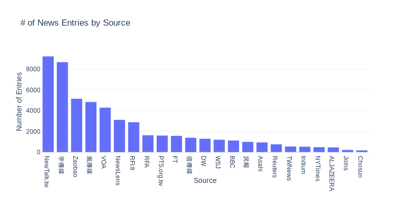
Plotly.py:
Plotly Express:
Honestly the code chunks are not much different from each other. But the Plotly Express API might seem more familiar for people who has worked with seaborn, matplotlib, or ggplot2.
Number of Entries by Date
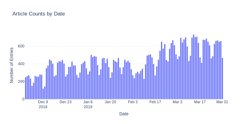
Plotly.py:
Plotly Express:
Again, not much different. But note that the Plotly.py API allows you to do data transformation inside the iplot call; the Plotly Express requires you to finish preparing the dataframe before the px.bar call.
Percentage of Titles Mentioning Trump and Xi Jinping by Souce
Now we hit a problem. The Plotly.py allows us to plot the two data frames simultaneously:
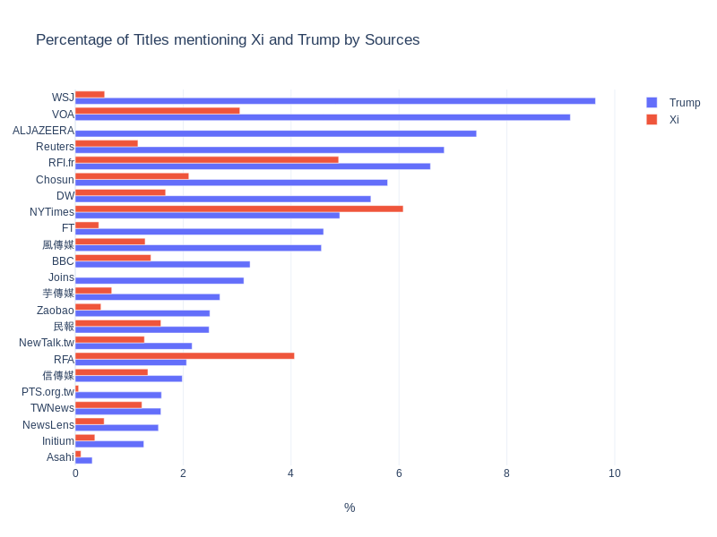
Plotly.py:
I don’t see an easy way to replicate the above plot in Plotly Express. One possible approach is to combine the two data frames and use the color parameter to distinguish one from another.
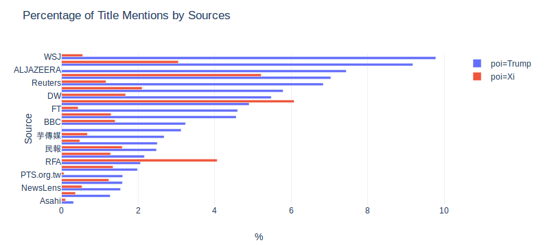
Plotly Express Attempt One:
The problem of this approach is that this API only allows stacking the two bars together, instead of grouping them. In this particular context, I think stacking makes it harder for reader to read the chart. So we have to find another way.
(20190507 Update: Now it’s possible to pass barmode="group" to px.bar.)
Another option is to use the facet_rol or facet_col parameter:
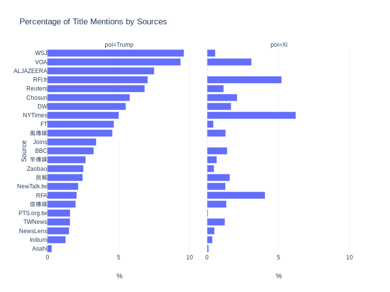
Plotly Express Attempt Two:
Much better now. However, I did not find a way to change the facet labels (“poi=Trump” and “poi=Xi”).
My Two Cents
I guess the Plotly team have receieved a lot of complaints about its API. The original/core API is arguably not very intuitive (for people with experiences of other visualization framworks). In response they developed Plotly Express.
Personally I don’t think the usability is very bad. That being said, I do need to constantly refering to the documentation, example or past code even when creating fairly simple plots. Plotly Express will shine in those situations where you just want to quickly make okay-ish interactive plots (e.g. when you first got the data and started to do EDA).
The understandable tradeoff between usability and customizability means it’s harder to do some custom aesthetic changes in Plotly Express. Rather than spending time learning how to do advanced customization in Plotly Express, I’d just use the original Plotly API when I need more publication-ready plots.