This is a short post describing how to use Plotly to make text-heavy charts cleaner in R.
Introduction
David Robinson presented a beautiful way to visualize the ratings of the Office episodes in this screencast:
The chart (shown below) is sufficiently readable when zoomed in on a full HD monitor, but is quite messy when exported to a smaller frame. Moreover, some of the episode names are not displayed (to avoid overlapping).
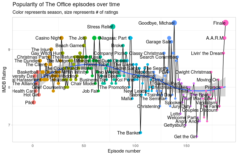
Plot generated by ggplot2
The code used to generate the above chart(full code here):
office_ratings %>%
  mutate(title = fct_inorder(title),
         episode_number = row_number()) %>%
  ggplot(aes(episode_number, imdb_rating)) +
  geom_line() +
  geom_smooth() +
  geom_point(aes(color = factor(season), size = total_votes)) +
  geom_text(aes(label = title), check_overlap = TRUE, hjust = 1) +
  expand_limits(x = -10) +
  theme(panel.grid.major.x = element_blank(),
        legend.position = "none") +
  labs(x = "Episode number",
       y = "IMDB Rating",
       title = "Popularity of The Office episodes over time",
       subtitle = "Color represents season, size represents # of ratings")
Solution
To make the chart cleaner, we can use Plotly to hide the names of the episode in tooltips, only be shown to the user when hovered over (Robinson and also someone in the YT comment section briefly mentioned this). I’ve put in some time figuring out how to do it, and here’s the result:
(You can also view it here on Plotly Chart Studio.)
Much cleaner, isn’t it! Try hovering over episodes and see what’s in the tooltip. Code:
library(plotly)
tmp <- office_ratings %>%
  mutate(title = fct_inorder(title),
         episode_number = row_number()) %>%
  ggplot(aes(x=episode_number, y=imdb_rating)) +
  geom_line() +
  geom_smooth() +
  geom_point(aes(color = factor(season), size = total_votes, label=title)) +
  theme(panel.grid.major.x = element_blank(),
        legend.position = "none") +
  labs(x = "Episode number",
       y = "IMDB Rating",
       title = "Popularity of The Office episodes over time",
       subtitle = "Color represents season, size represents # of ratings") +
  scale_x_continuous(limits = c(-2, 191), expand = c(0, 0))
ggplotly(tmp, tooltip=c("label", "y", "colour"))
Summary:
- Remove
geom_text. - add
label=titletogeom_point. - Convert the ggplot object into an plotly object:
ggplotly(tmp, tooltip=c("label", "y", "colour")).
Bonus: How to Upload and Share Chart
The simplest way to share your new Plotly chart is to upload it to Plotly Chart Studio and use the export function there. You can save it as a static image, a standalone HTML page, or embed it using iframe like I did in this post.
The first step is to create a Plotly account. You can use plot::signup or use the Web UI to do this.
Then you need to get the API key in the settings.
Save the username and the API key as environment variables:
Sys.setenv("plotly_username" = "NAME HERE")
Sys.setenv("plotly_api_key" = "API KEY HERE")
Then simply call api_create(plotly_obj) to upload the chart.