I’ve been looking for a way for me to easily develop and share data visualization. I don’t want static image files because of their inflexibility, and creating every plots using D3.js seems like an overkill. Plotly, a web service that creates plots based on D3 and provides API for both Python and R, has so far been a very good match for my needs. To get started, you can read this tutorial for R, or the official documentation.
In this post I’m going to demonstrate Plotly by analyzing a data set obtained from data.gov.tw. The data set contains the number of deaths every year in Taiwan from 1991 to 2014 that were caused by cancer, categorized by the type of cancer, location, sex, and age group. There were a change of ways of categorizing cancers in 2008, so for convenience we’re going to focus on the data after the change.
Firstly we need to read in the data. (I tried to translate the types of cancer from Chinese into English. Please pardon me if I get some of them wrong.)
library(data.table)
library(ggplot2)
library(plotly)

cancer = fread("cancer97-103.csv")
causes = data.table(read.csv("causes.csv", encoding="UTF-8"))
cancer = merge(cancer, causes, by="cause")
# Transform the year format into an international recognizable one
cancer$year = cancer$year + 1911
Then we need to aggregate the data based on cause_name and year. We also calculate the percentage change in deaths from 2008 to 2014
by_year = cancer[,.(N=sum(N)), by=.(year)]

by_cause_year = cancer[,.(N=sum(N)), by=.(year, cause_name)]

by_year$ratio = by_year$N / by_year$N[1]

by_cause_year$ratio = 0
for(c in unique(by_cause_year$cause_name)){
  by_cause_year[cause_name==c]$ratio = by_cause_year[cause_name==c]$N / by_cause_year[cause_name==c]$N[1]
}
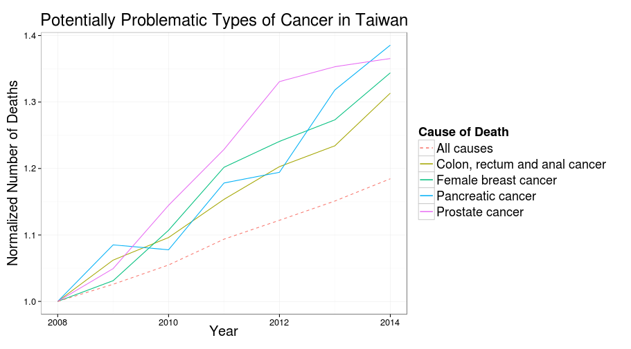
Finally, we find the types of cancer whose death counts are larger than 1000 and increasing significantly faster than all deaths from cancer.
increasing = by_cause_year[cause_name %in% by_cause_year[year==  2014 & N > 1000 & ratio >= 1.3]$cause_name]

line_plot_1 = ggplot(increasing, aes(x=year, y=ratio)) +
  geom_line(aes(group=cause_name, colour=cause_name, linetype=cause_name)) +
  geom_line(aes(linetype="All causes", colour="All causes"), data=by_year) +
  scale_colour_discrete() +
  scale_linetype_manual(values = c("dashed", rep("solid", 8))) +
  labs(colour="Cause of Death", linetype="Cause of Death") + theme_bw(base_size = 16) +
  xlab("Year") + ylab("Normalized Number of Deaths") + ggtitle("Potentially Problematic Types of Cancer in Taiwan") +
  theme(legend.title=element_text(size=18), legend.text=element_text(size=18),
        title=element_text(size=20, vjust=1))

# Render the plot locally
line_plot_1
# Publish the plot to Plotly
ggplotly(line_plot_1)
Here’s the plot generated by ggplot2 locally:
And here’s the plot generated by R API of Plotly:
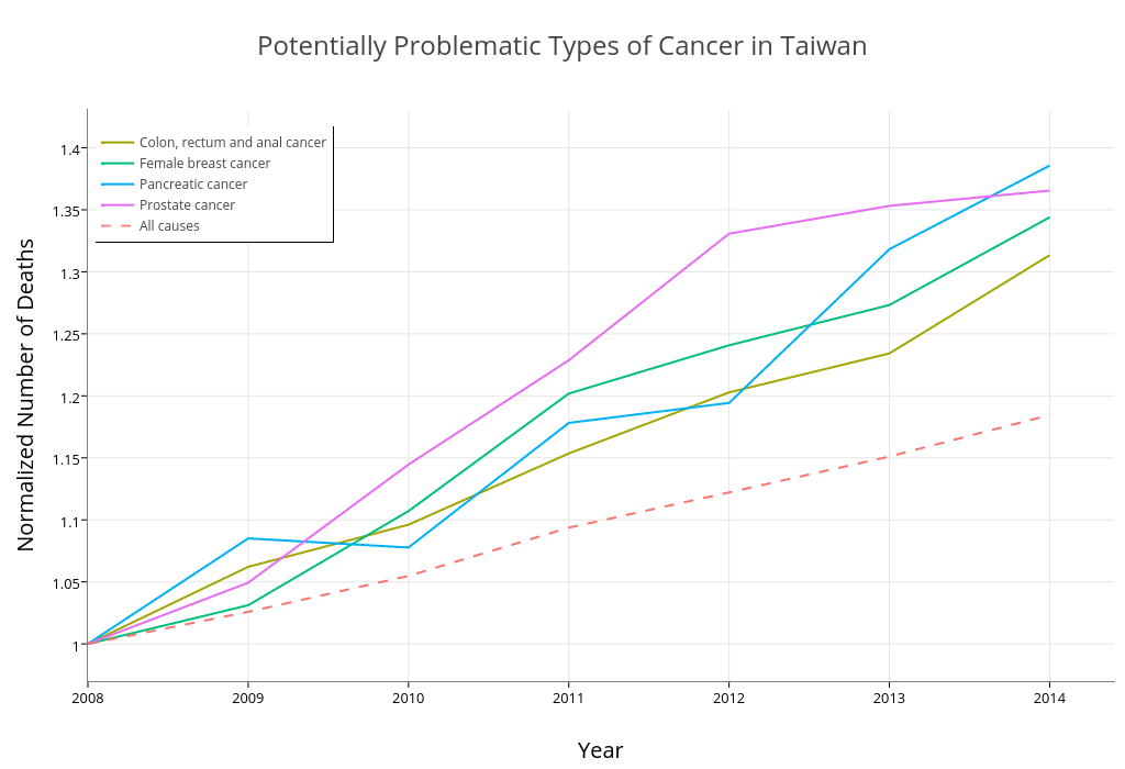
I had to made some aesthetic adjustment in the web interface of Plotly, but overall it’s very easily to publish the plot directly from a ggplot2 object. And Plotly automatically made the plot interactive! Brilliant!
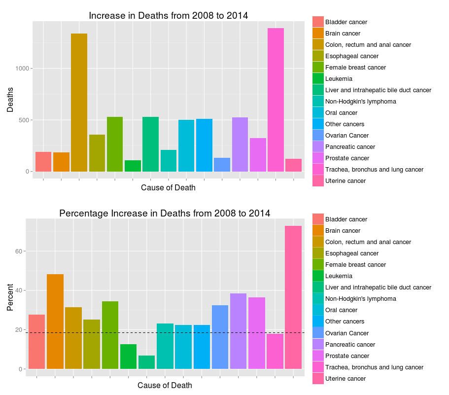
I also want to draw two bar charts comparing the absolute and percentage increase in number of deaths. We’ll be able to see that while some types of cancer has higher rate of growth, the numbers of deaths are not high enough for our full attention. Some balance between these two metrics should be found.
year2014 = by_cause_year[year==2014]
year2008 = by_cause_year[year==2008]

tmp = merge(year2014, year2008, by="cause_name")
tmp$delta = tmp$N.x - tmp$N.y
change_6_year = tmp[,c("cause_name","delta", "ratio.x"), with=F]
rm(tmp)

p1 = ggplot(change_6_year[abs(delta)>100], aes(x=cause_name, weight=delta, fill=cause_name)) +
     geom_bar() + scale_x_discrete(labels=NULL) +
     xlab("Cause of Death") + ylab("Deaths") +
     ggtitle("Increase in Deaths from 2008 to 2014") + labs(fill=NULL)

p2 = ggplot(change_6_year[abs(delta)>100], aes(x=cause_name, weight=(ratio.x-1)*100, fill=cause_name)) +
     geom_bar()+ scale_x_discrete(labels=NULL) +
     xlab("Cause of Death") + ylab("Percent") +
     ggtitle("Percentage Increase in Deaths from 2008 to 2014") + labs(fill=NULL) +
     geom_hline(yintercept = 18.46, linetype="dashed")

# Render locally
library(gridExtra)
grid.arrange(p1, p2, ncol=1)

# Publish to Plotly
ggplotly(p2)
ggplotly(p1)
This brings us to another issue/constraint of Plotly – We can’t combine multiple plots in one place as we can locally using gridExtra. Facet plots should still work, though.
Local plots (dashed line represents the overall percentage growth):
Plotly version of the plots:
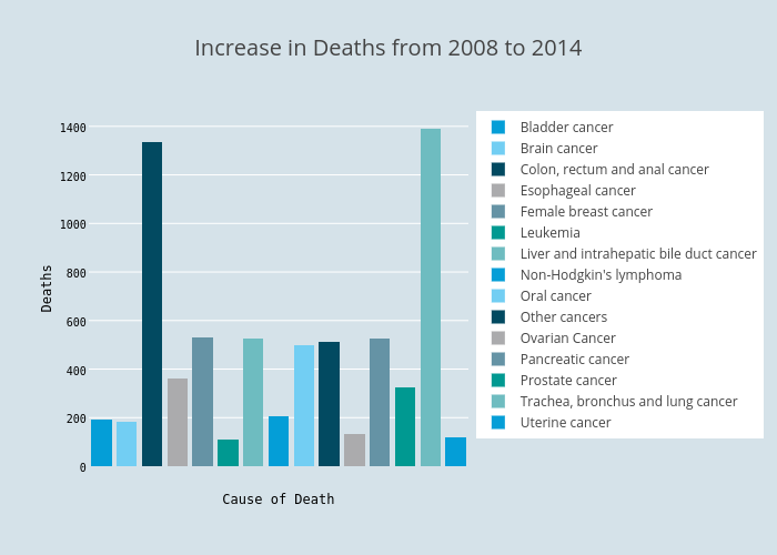
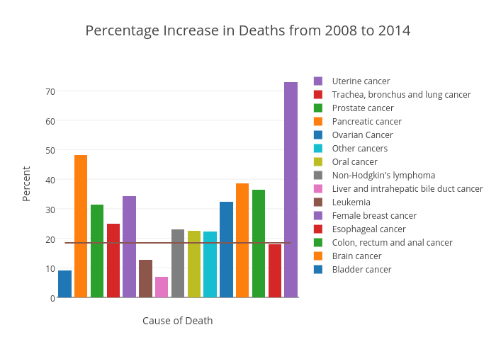
The horizontal line in the second plot failed to extend to both ends of the x-axis. Couldn’t find a way in the web interface to fix that.
In conclusion, there are some loses of information from ggplot2 objects to Plotly, but most of them are easily fixable through the web interface. Plotly can save data scientists a lot of time with their powerful API. I might also try the API for Python and see if it works as well as the one for R.